Great print design doesn't stop at the layout—it survives the press.
Print campaigns designed with production in mind built to spec in Adobe InDesign, with careful attention to bleed, color separation, and prepress standards.
Each project reflects a balance of creative direction and technical precision, ensuring designs translate seamlessly from screen to press.
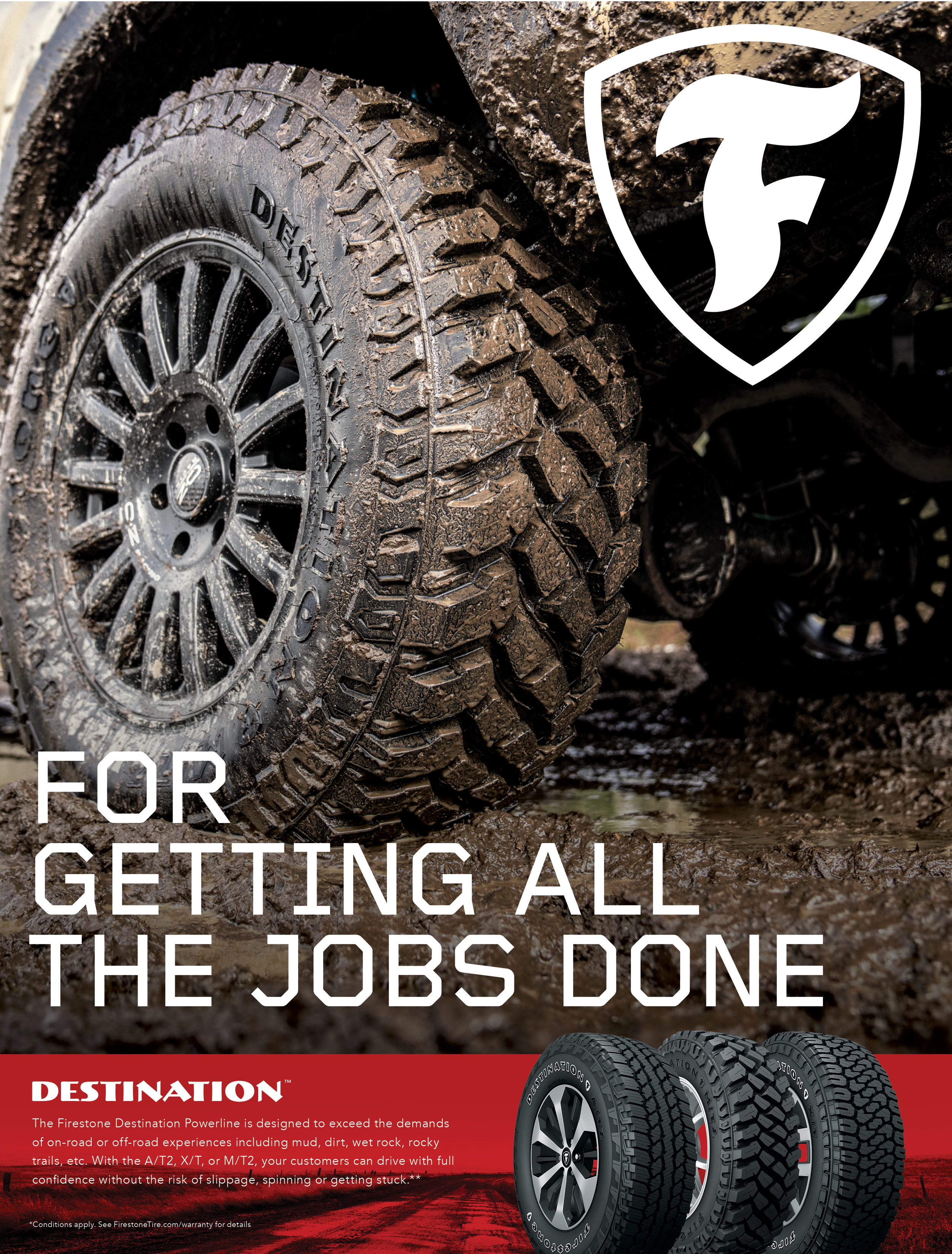
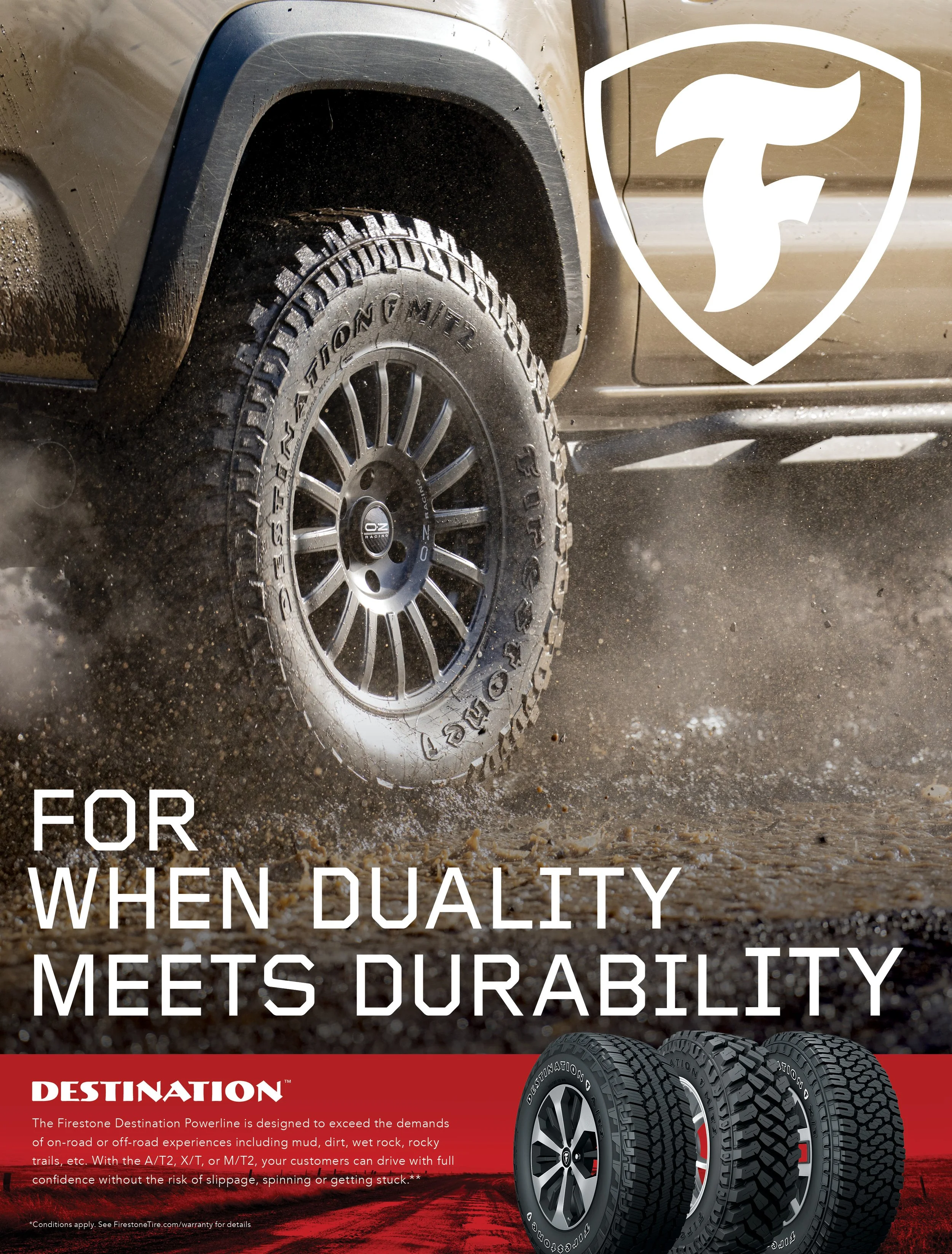
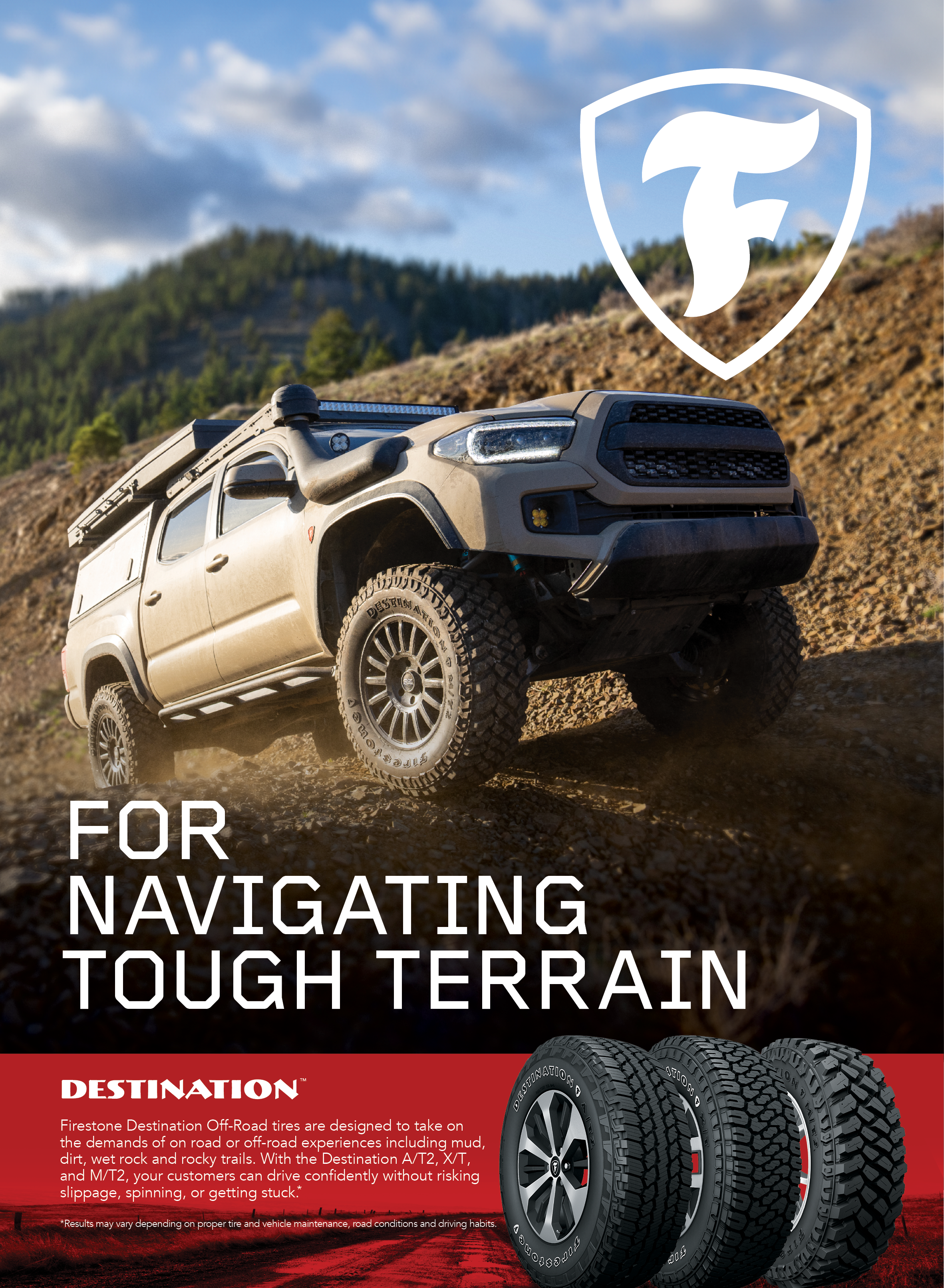
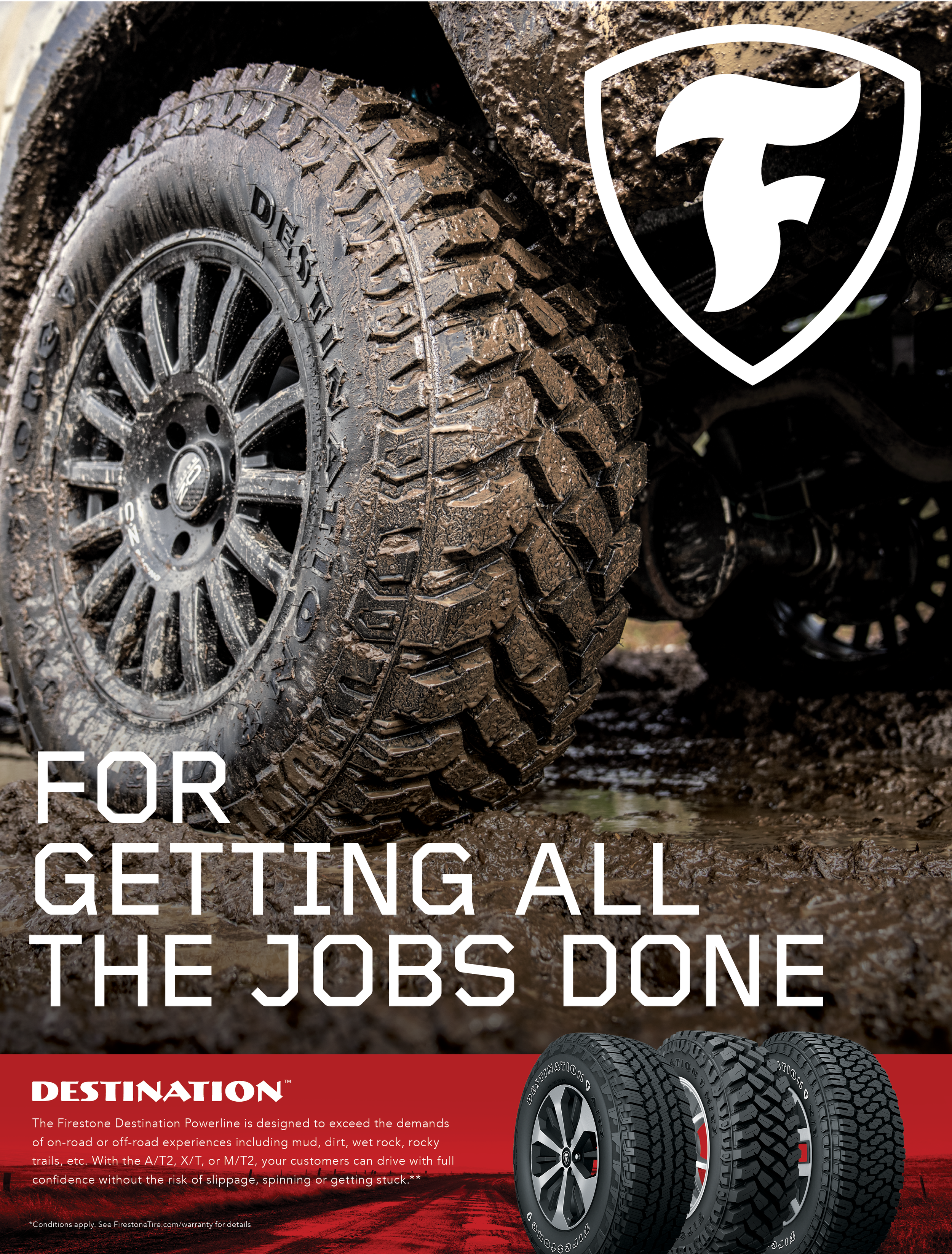
The brief was to use footage captured to develop a series of possible print layouts for Firestone’s Destination Powerline series that were set to appear in various trade magazines.
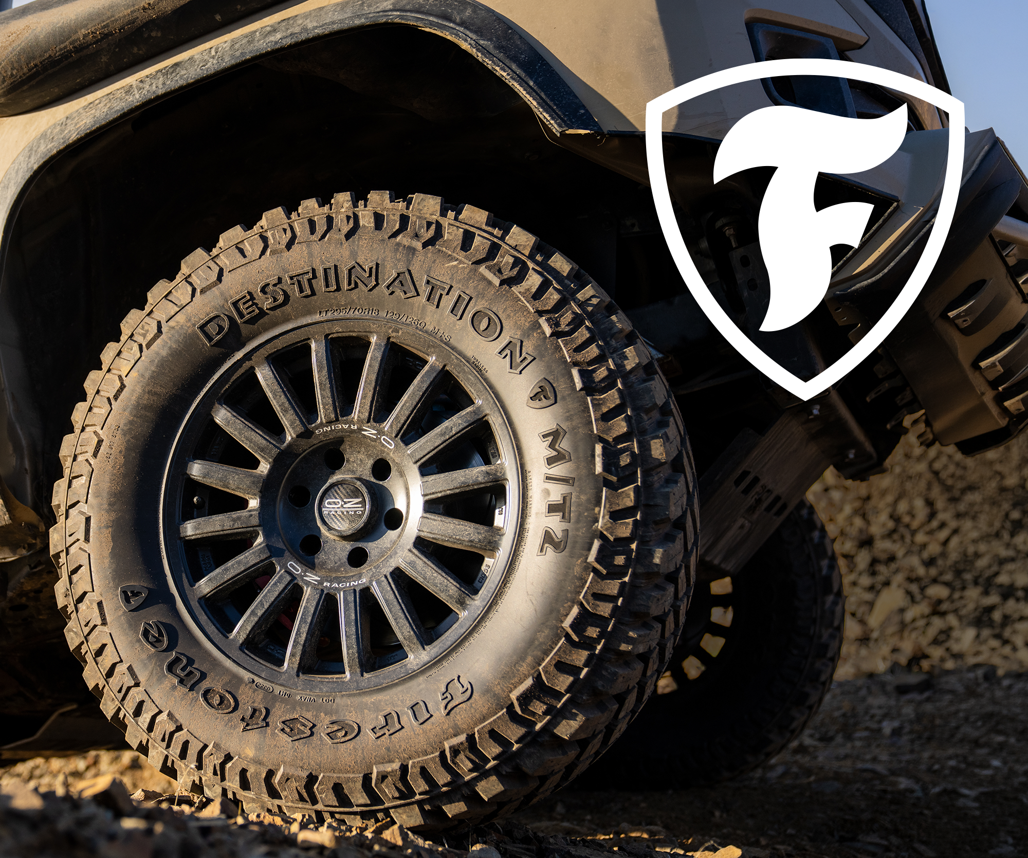
Image choice was essential as we wanted the best shots that would highlight the rugged terrain of the tire, illustrating the ability of the tire to get you through any kind of terrain.
In terms of layout, hierarchy between logo, art and typography was designed with the printing process in mind. Special care was given to take into account bleed, trim, safety margins, color mode (CMYK), resolution, and paper stock—so the toughness that appears on screen translates precisely to the printed page.